MortgageSense is a proposed sub-product for Tangerine bank in the form of a web platform, designed to assist first-time home-buyers through the process of financing their first property, from planning to moving in. The solution is a product proposal created within the bounds of a senior-level experience design course at Simon Fraser University and is not directly affiliated with Tangerine bank.
Besides contributing to the discussions and design decisions on my team, I did research on the problem area, prototyped iterations of the interface, conducted user tests, and created micro-interactions.
Victoria Maslova, Paola Ortiz, Cora Zhou, Bryan To, Pradeesh Motha
Check out the full prototype below!
Financing a home is a stressful and complicated process for first-time home buyers who have little to no knowledge of the mortgage process. Tangerine positions itself as an innovative bank with no complicated products that “keeps up with your unique needs and goals”, but lacks the required support that first-time millennial home-buyers need.
Through secondary research we found that "72% of mortgage consumers gathered mortgage related information online and 65% of first-time homebuyers got their mortgage with their current financial institution." ( Survey of 3,500 recent mortgage consumers across Canada, CMHC 2022)
The current homebuying process with Tangerine Bank is missing crucial guidance around the application stages, and most of the document handling is relayed through email or phone conversations, resulting in delay and compromised security of sensitive information. Resources on mortgages are also scattered within the blog pages of the website, requiring the user to dig deep to find information.
After defining the problem space, we as a team conducted primary research to get further insight into the homebuying experience within Canada. In week 2, we formulated a survey targeting prospective and experienced homebuyers where our goal was to identify the demographic of the target user of online banking and find out which steps of the homebuying process they found most challenging. Out of the 170+ responses, 105 responses were found suitable for research due to the level of completion and legitimacy.
After analyzing the survey results, out of 105 responses, 67% of current and prospective homebuyers reported feeling overwhelmed, anxious, and lacking knowledge in approaching or going through the mortgage process.
"Mortgages are complex, and customers have to deal with multiple systems and touchpoints…[They] are not provided with a single interface for mortgage application, documentation and follow-up." - (Improving Mortgage Customer Experience, Report by Infosys, 2019)
As of April 2022, Tangerine consisted of over 2.5 million national clients, with their primary target audience being millennials between ages 18 and 44. Through secondary research we gathered the following demographic data.
51% of first-time homebuyers are less than 35 years old (Canadian Housing Survey: A profile of first-time homebuyers. Statistics Canada, 2018)
62% of Tangerine clients are between the ages of 18-44 years old (Data from Similarweb, 2022)
87% of the target group prefer person-less banking (Survey of 3,007 Canadians regarding Method of Banking; Study by Phoenix SPI for FCAC. Jul., 2019)
Based on the data we found, we defined three possible stakeholders who are in relation to the project's domain.
First-time Homebuyer - The individual seeking information about the homebuying process and seeking assistance in financing their first home purchase.
Repeat Homebuyer - The experienced homebuyer owning one or more properties, seeking for mortgage options for an additional property.
Tangerine Mortgage Advisor - The client support member of Tangerine, assisting clients with their account and mortgage application during the homebuying process.
Due to the project time constraints, our team chose the First-time homebuyer as the target audience of the research and product strategy.
As a team, we formulated a guiding question to set the project on a main trajectory, addressing the most prominent needs of the first-time homebuyer persona:
Using the digital web platform, how can Tangerine increase transparency, credibility and guidance throughout the mortgage process in order to empower clients to make well informed choices for home financing?
As a team, we applied the Google Design Sprint process to propel ideation of the solution and its experience for the user. Starting with the user journey, we defined Mortgage 101 and Pre-approval as the key pain-point to dig into when formulating the solution. Particularly, the aim of the first design sprint was to tackle the question of what financial considerations should be made before applying for a loan, and what the stages of applying for a mortgage are.
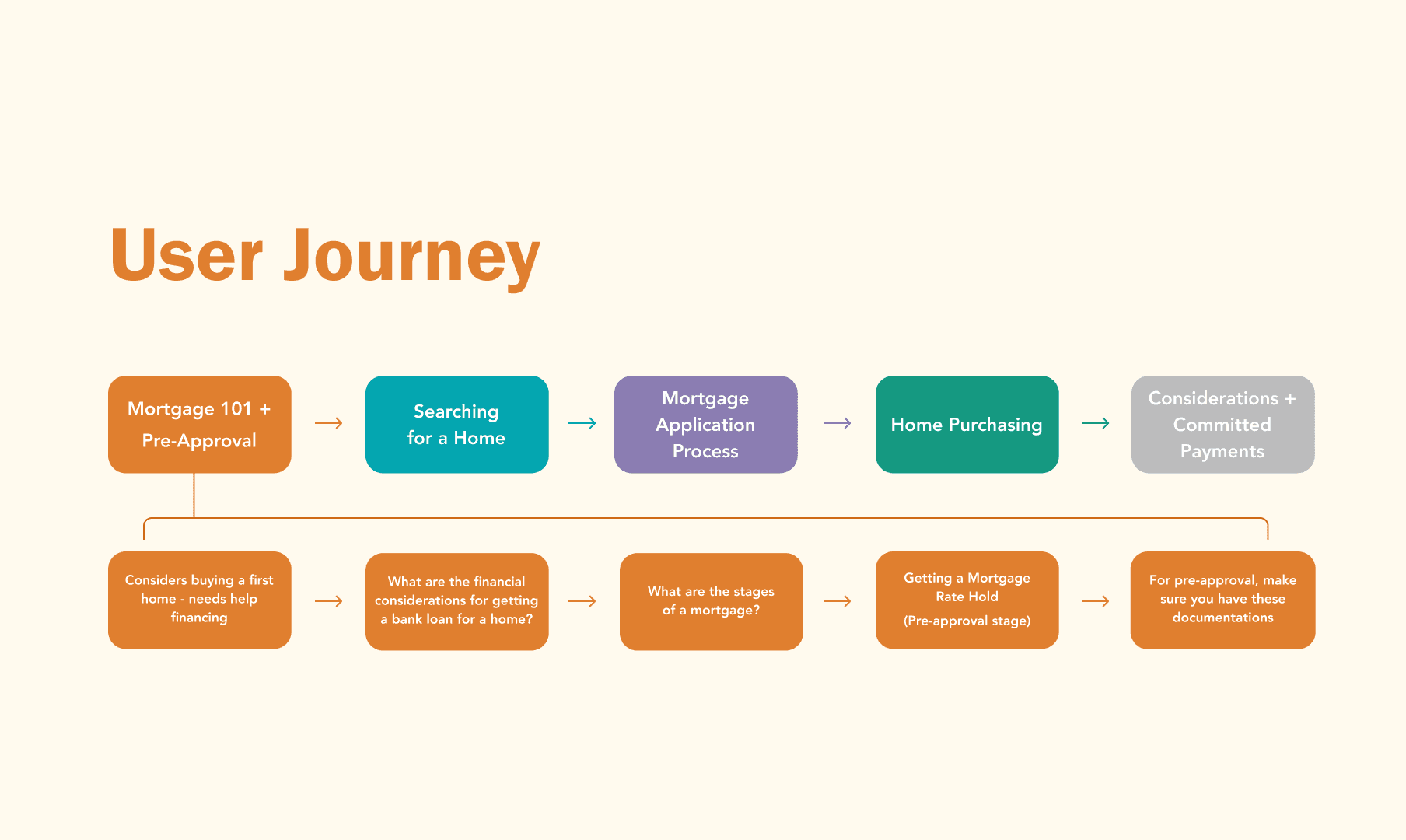

User journey diagrams of a first-time homebuyer
The first week produced the following sketches from a team workshop applying Lightning Demos, Crazy 8s, and Storyboarding. In plain language, we looked into examples from industry products and design professionals, then sketched initial ideas of the digital solution, and lastly, combined applicable ideas into a consumer journey through a storyboard, illustrating how an experience unfolds for the home-buyer. After each exercise, we pitched our ideas to each other, then voted on the best ones to move forward with.
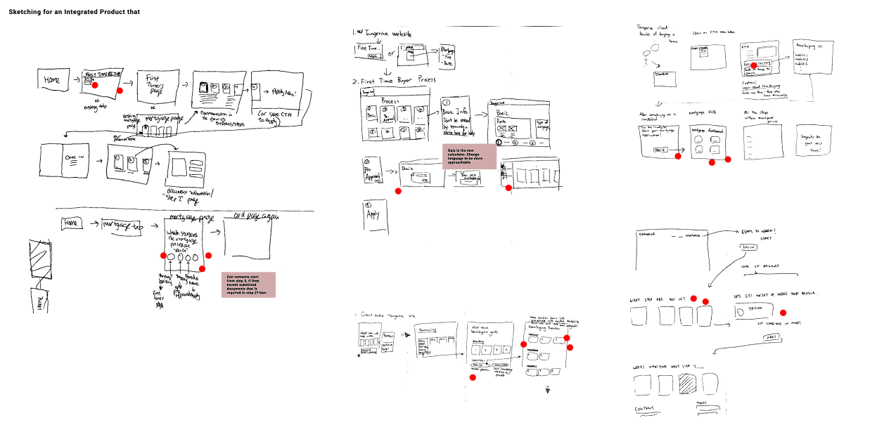
Sketches from our design sprint
Next, we moved on to building a lo-fi prototype on Figma. Our main goal in this stage was to define the layout of elements on each page within MortgageSense. Each member worked on building different pages, and my part was to design the documents page. The diagrams below are just some of the many wireframes that were made during the sprint process.
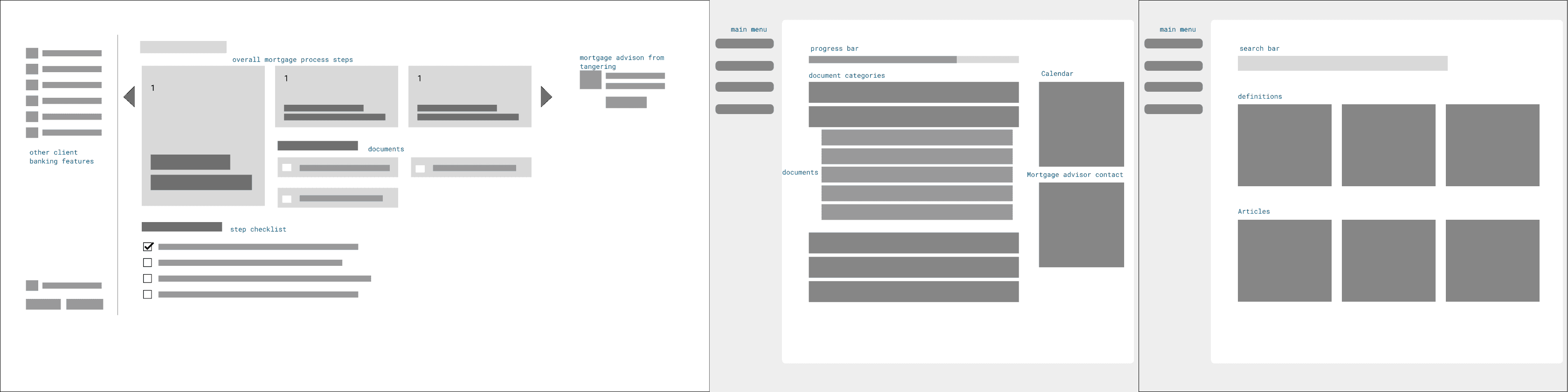
Low-fidelity wireframes(top) mid-fidelity wireframes(bottom) of main page, documents page, and resources page
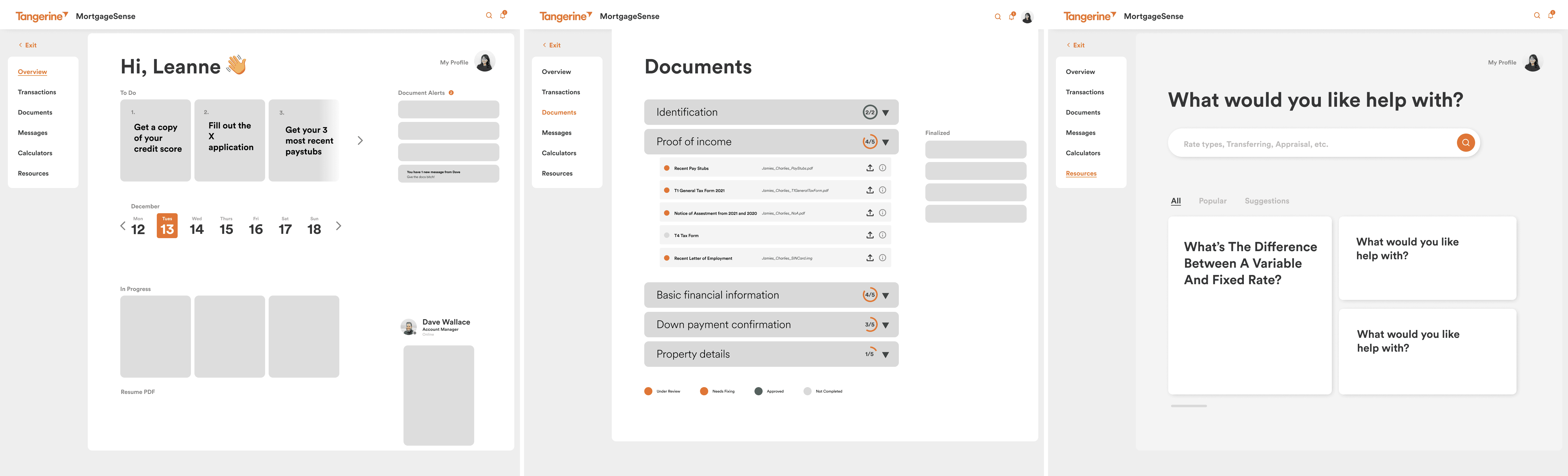
As seen through our research, first-time homebuyers lacked financial knowledge in homebuying which is why we focused on building out MortgageSense in a step-by-step guide that allows the user to extend their knowledge base. Each step would provide information regarding what the user must do to move on to the next part of the process. The team made three or more iterations of page(documents page, main dashboard) and then moved forward to mid-fidelity prototypes after voting on the best ones.
I took lead on the documents page. In the document submission page, the user is required to upload documents required by the Account Manager from Tangerine. In this section, the documents will be categorized under "to do", "pending", or "completed". This pattern of categorization is introduced to promote transparency of the application process for the client. The resources page contains mortgage related information such as terminology, articles, and videos on homebuying tips. The tools page is where the user can use the redesinged mortgage affordability calculator that contains simplified financial jargon that first-time homebuyers could understand.
We set up user tests with 10 participants to conduct a qualitative analysis of the user flow of the main functions in MortgageSense. I interviewed 3 participants over Zoom and using the think-aloud approach I asked the participants to perform specific tasks on the main pages of the interface. As participants talked through their process I observed and made notes on how they performed the tasks, what steps did they take to achieve them, and what tasks did they struggle with.
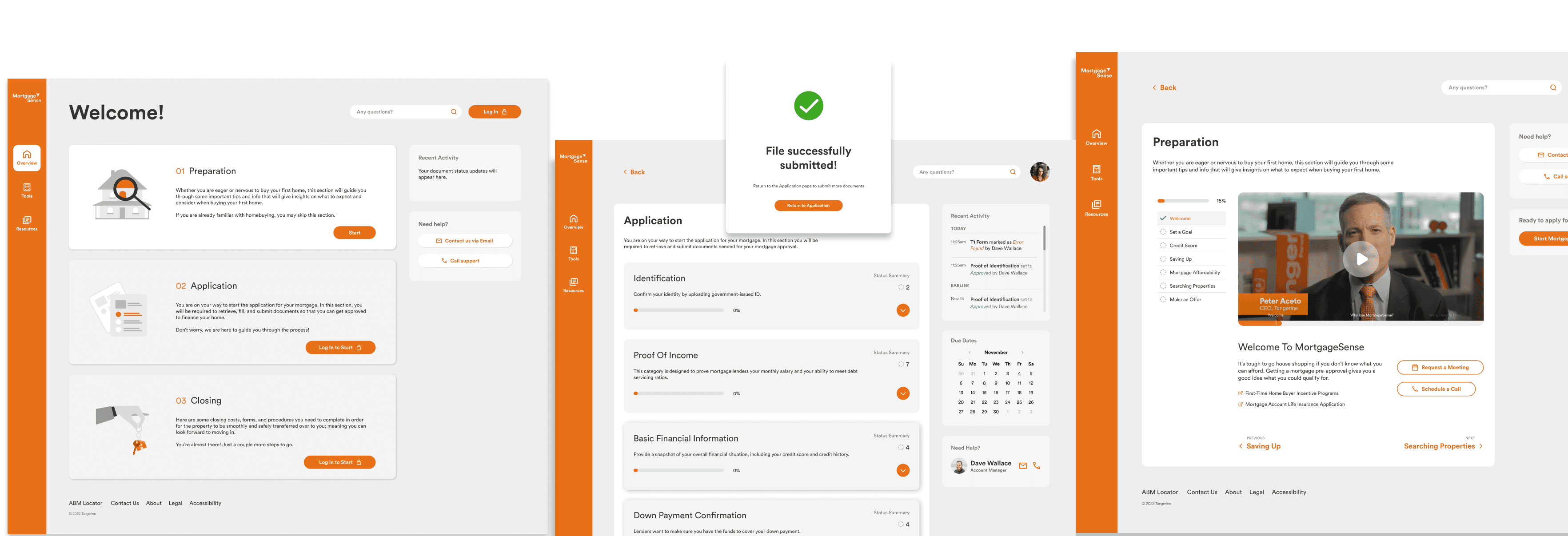
After conducting our user tests, we analyzed the user test findings and made necessary adjustments to the high-fidelity prototype based on insights. One of the common findings in our interviews was the participants were overwhelmed by the contents displayed on the main dashboard.
To solve this issue, we made a pivotal change in the product's journey by dividing the whole homebuying journey into three distinct phases: Preparation, Application, and Closing. The preparation phase (which is optional) allows the first-time homebuyer to navigate through a set of lessons that teach the basics of home buying and mortgages. Once completed they move onto the application phase where they meet their Account Manager and submit necessary documents. And finally the closing phase contains other fees to be paid after the home purchase.

(Left) First iteration of high-fidelity prototype with list of steps in the journey. (Right) Final prototype
with journey divided into three stages
Another major consideration for our final iteration was the status icons and labels on the documents page. Our focus was to display documents in a way that is not overwhelming and provide as much contextual clarity for ease of use. In the final iteration the documents are sorted based on priority, hover states for clarity and primary document actions listed in a sub-menu list.
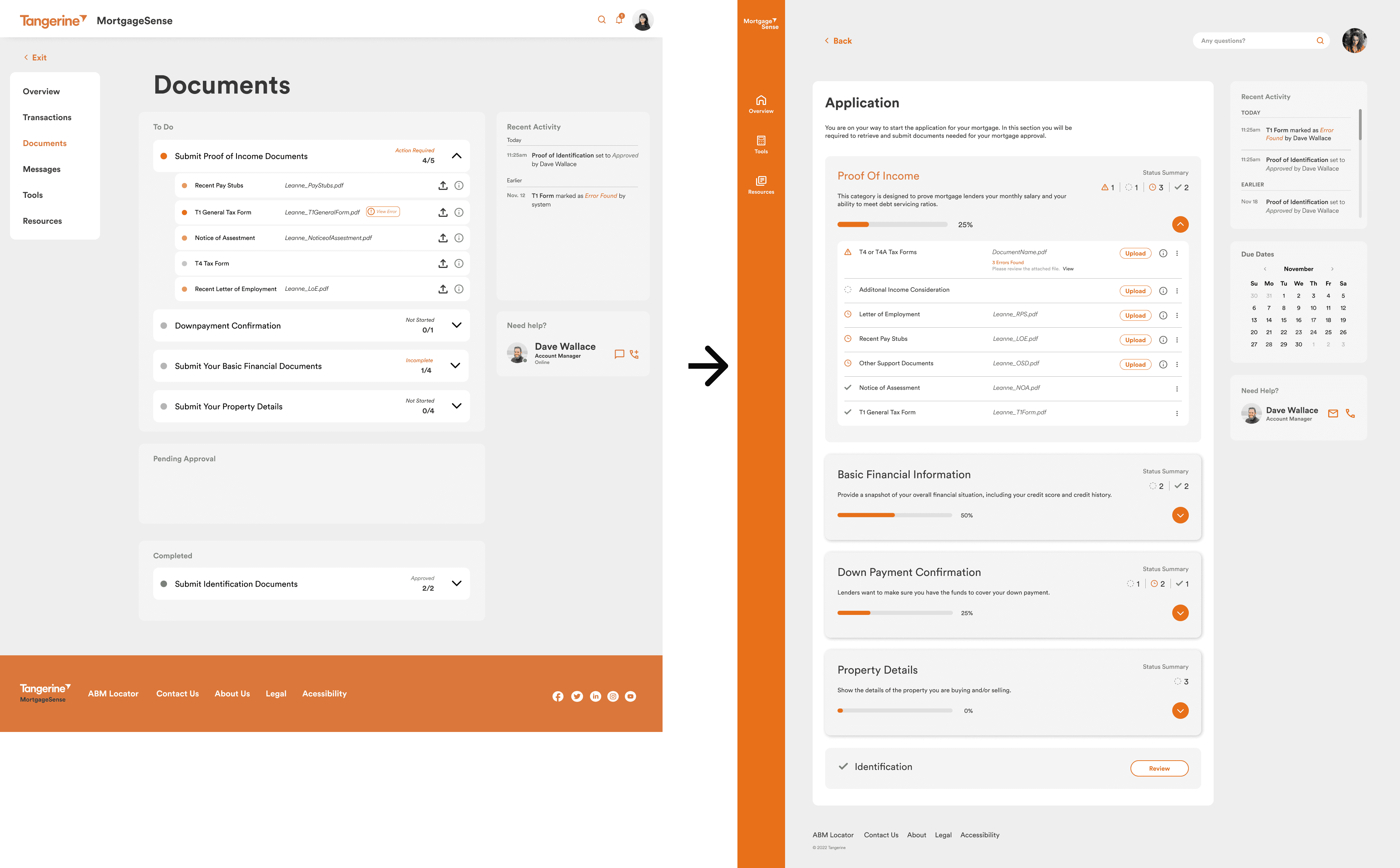
(Left) First iteration of high-fidelity document page. (Right) Final prototype
of document page.
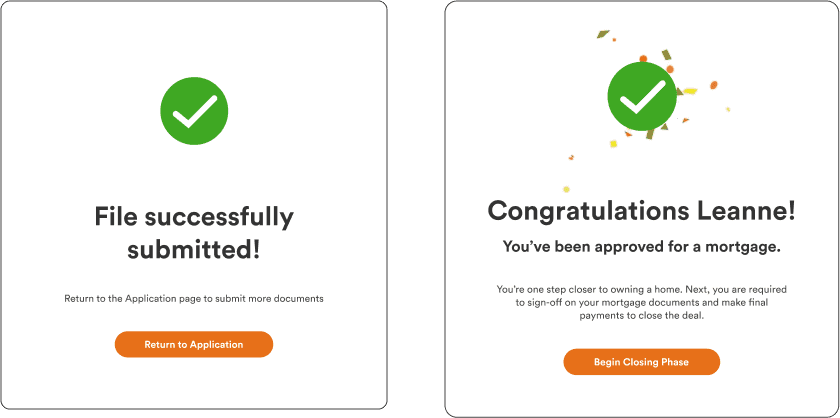
Lastly, we decided to include celebratory messages to bring a more personal touch to the product. Milestones can encourage clients to stay on track with their tasks while celebrating their major accomplishments. I took charge of designing the micro-animations and the celebratory message UI.
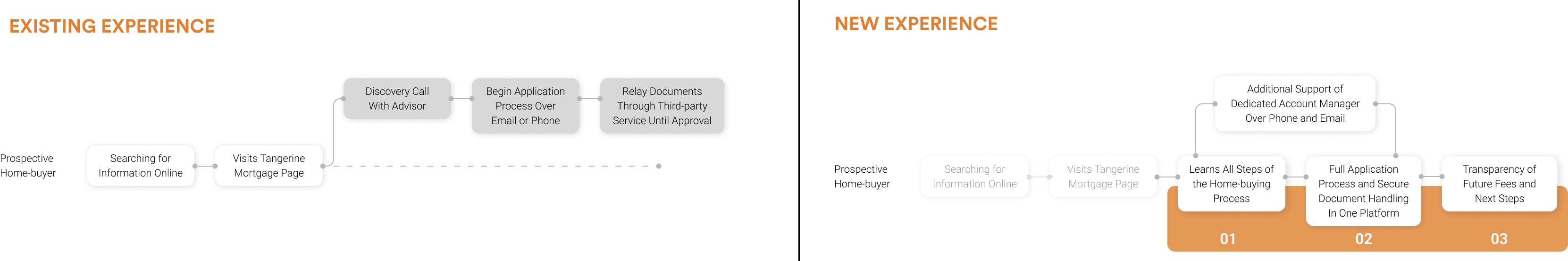
(Left) Existing user experience (Right) New user experience after our intervention
Staying true to the brand's iconic accent orange the goal was to elevate the content accessibilty. As a functional website providing banking services, the neutral colours such as black, grey, and white were used to establish a sense of fundamental clarity. Appropriate contrast ratios were used for when combining elements of different colours keeping in mind of Web Content Accessibility Guidelines.
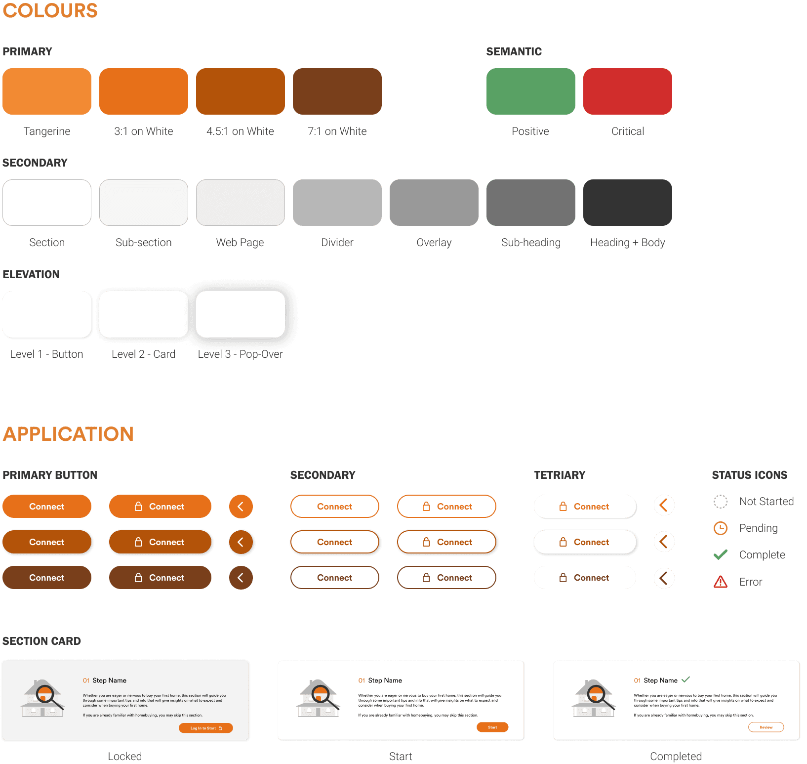
(Top) Colours and effects used in UI (Bottom) Application of those colours and effects
Conclusion
MortgageSense allows Tangerine to pioneer the evolution in digital banking, embracing digital technologies to redefine the touchpoints, expectations and modern needs of clients. Serving clients in their moment of need contributes to client loyalty to Tangerine. And as for clients,MortgageSense allows them to extend their knowledge to help them make financial decisions independently and confidently.
This was an intense six-week project in a senior experience design course, through which I learnt a lot about improving existing brand values of an organization by applying a design process and design methodologies. This project helped improve my visual design skills, soft skills, and time-management skills all of which helped our team succeed every week when meeting milestones. Our project received faculty recognition and was chosen to be presented at the SFU Undergraduate Conference in 2023. The project is also showcased on the faculty's project showcase page here.
Check out the full product walkthrough!